

 Credit: Disney
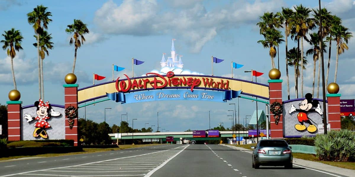
For many visitors heading to Walt Disney World Resort, the magic begins before they ever scan into a theme park. From dining reservations to ride wait times, much of the modern Disney vacation now runs through a single digital gateway: the My Disney Experience.
Over the years, the app has become the backbone of a Disney trip. Guests rely on it to book Lightning Lane selections, check attraction wait times, find character meet-and-greets, and navigate the sprawling resort property. For first-time travelers especially, the app can feel almost as essential as a park ticket.
But as Disney’s parks have grown more digital, expectations around the app have grown as well. Fans often debate which features work well—and which still need improvement. Even the smallest changes can quickly spark conversation across the Disney fan community.
Recently, one particular update quietly arrived, and while it might look minor at first glance, it’s already catching the attention of park regulars.
Disney Fans Have Long Debated One Major Weak Point in the App
For all of its powerful features, the My Disney Experience app has never been immune to criticism.
Among the most frequently mentioned frustrations is the app’s search function. Guests trying to find attractions, dining locations, or entertainment options sometimes report inconsistent results or confusing navigation paths.
For example, a guest searching for something as simple as “roller coaster” might reasonably expect the app to surface major attractions like Space Mountain or TRON Lightcycle / Run. Instead, the search results have occasionally felt scattered or difficult to parse.
Because of this, the search experience has quietly become one of the most discussed improvement areas among frequent parkgoers.
Fans have hoped Disney might eventually revisit the feature—not just for aesthetics, but also for accuracy and usability.
Now, it appears Disney has taken its first step.
A New Version of Disney’s App Arrives With a Different Look
A new update for the My Disney Experience app has begun rolling out, bringing the platform to version 8.19.0.
At first glance, the update doesn’t dramatically change how guests interact with the app’s core functions. Attractions, dining options, and park information remain accessible in familiar ways.
However, one area now looks noticeably different: the search results screen.
The update introduces a redesigned interface that emphasizes a more visual, card-style layout for search results. Instead of tightly packed lists, the app now highlights individual results with larger images and more prominent visual elements.
In other words, the interface feels more modern—and better aligned with the design trends seen across many popular mobile apps.
But the change does come with a tradeoff.

The App’s New Search Results Layout Is Visually Different—but Functionally Similar
The updated interface places greater emphasis on imagery attached to search results. Attractions, dining locations, and other destinations appear within larger visual cards, making them easier to identify at a glance.
However, because of the expanded design, fewer results appear on the screen at one time compared to the previous version.
Importantly, this update is primarily visual. The underlying search results themselves remain largely the same as before. Guests searching for specific terms should still see similar listings as they did prior to the update.
The redesign simply changes how those results are presented.
Still, many observers view the change as a sign that Disney may be exploring deeper improvements to the app’s search system in the future.

What This Update Could Mean for Future Disney Park Planning
For now, the new search results interface appears to be a visual refresh rather than a full system overhaul.
But even subtle changes inside the My Disney Experience app can signal a broader direction for how The Walt Disney Company approaches its digital park tools.
As Walt Disney World continues to integrate mobile planning deeper into the park experience, improvements to search, navigation, and information discovery could make a significant difference for millions of guests planning trips each year.
If Disney does expand on these updates in the future, fans hope it could lead to faster, more accurate search results—helping visitors locate attractions, dining, and entertainment across the massive resort property.
For now, though, the update serves as a reminder that even the smallest changes in Disney’s digital ecosystem rarely go unnoticed by the passionate park community.
What do you think about the new My Disney Experience app design? Do you like the updated search results layout, or do you think Disney still needs to improve the search feature?
Source: BlogMickey