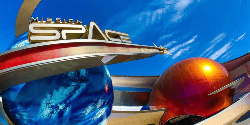
 Credit: Disney
For the past few weeks, the story with Disney’s new trash cans has been that they finally got themed.
That was the whole arc. The first big wave of solar-powered bins arrived in June, looking like something ordered out of a municipal supply catalog, and fans were not quiet about it. Since then, Walt Disney Imagineering has been rolling out versions built to match their surroundings. Neon green in World Nature. Orange on gray in Pandora at Animal Kingdom. Starfish logos in The Seas. The EPCOT logo around CommuniCore Hall.
The themed versions were the counterargument to every complaint about Disney sanding down the details in the parks.
So the newest batch is worth a second look, because these went the other direction.
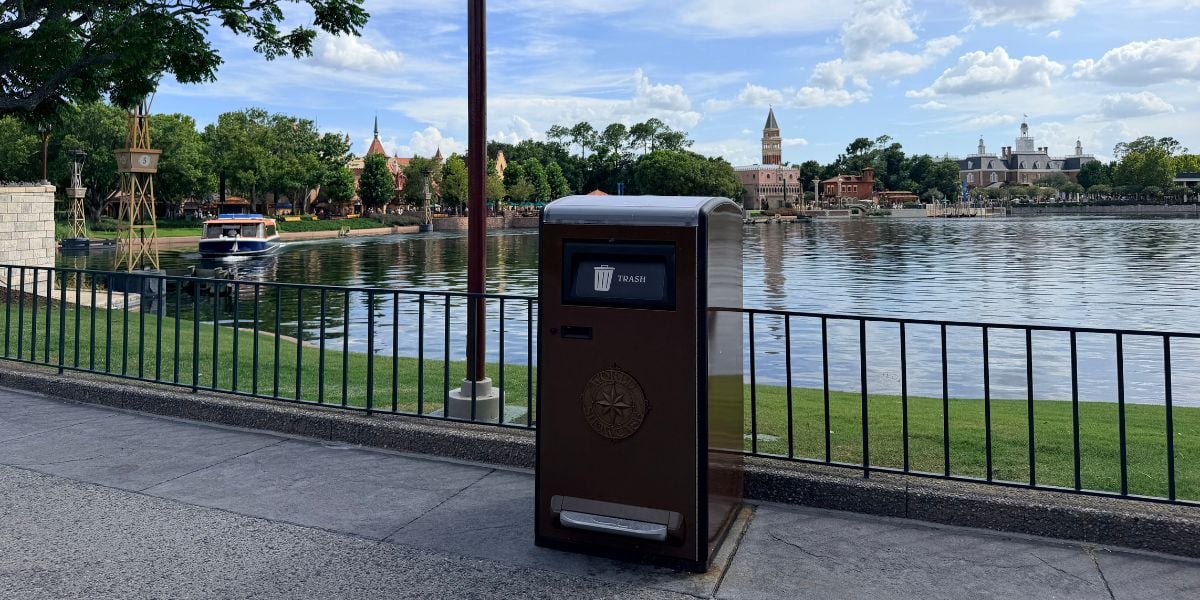
More solar-powered trash cans have arrived near Mission: SPACE at EPCOT, and they carry no design at all. Plain gray. No logos, no stripes, no color treatment.
Which sounds like a step backward until you stand where they are standing.
What Arrived at Disney
Roughly five sets total have appeared in the Mission: SPACE area.
That includes paired trash and recycling bins, along with several single trash cans. One sits by a bench near the entrance to Mission: SPACE. Another is positioned near the attraction’s moon, which has been roped off. There is also a trash and recycling pair near Space 220 Restaurant.
All of them are gray with no design, unlike the themed bins that have been showing up around the park recently.
Plain Solar-Powered Trash Cans Added Near Mission: SPACE at Walt Disney Worldhttps://t.co/aJV9vMrEGx
— WDW News Today (@WDWNT) September 8, 2026
Why Plain Might Actually Be Correct Here
Here is the case for these, and it is stronger than it first appears.
Mission: SPACE is not a colorful land. The whole area is built around a muted palette of grays, metallics, and cool tones, because that is what a space agency campus is supposed to look like. The architecture is deliberately restrained. The planets and the moon provide the visual interest, and everything around them stays quiet on purpose.
A bright neon accent would fight that. So would a logo treatment.

Plain gray is not the absence of theming in this specific location. It is theming that happens to look like nothing, which is exactly what a space center would use.
Compare it to the Pandora bins, which are gray with an orange stripe because Pandora is visually saturated and needed something restrained. Same instinct, different execution. The design brief in both cases was to not compete with the land.
Whether Disney thought about it that carefully is unknown. But the result works.
Where the Rollout Stands With Disney
EPCOT was the first Walt Disney World park to get these, starting near World Showcase in June.
The rollout at EPCOT has now reached:
- More of World Showcase, including the Japan and Italy pavilions
- The Seas, The Land, and Soarin’ areas
- World Celebration
- The Test Track area
- World Nature
- And now Mission: SPACE
At Animal Kingdom, the rollout began in July at the park entrance and Maharajah Jungle Trek, expanded to Asia and Discovery Island Trails in August, and reached Pandora earlier this month.
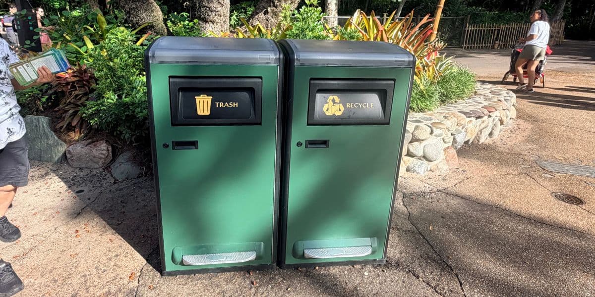
Disney has confirmed the bins will continue spreading across Magic Kingdom, EPCOT, Disney’s Hollywood Studios, Disney’s Animal Kingdom, Disney’s Typhoon Lagoon, Disney’s Blizzard Beach, Disney Springs, and the ESPN Wide World of Sports Complex.
No exact timeline has been given, but the pace suggests this runs for months.
How They Work
The solar panels built into the rounded tops power compactors inside the bins.
That compactor is the entire justification for the project. Compacted waste means each bin holds significantly more before it needs emptying, which cuts down the number of trips custodial cast members make throughout the day.
Guests can open the lids by hand or by foot pedal. The small handles on the front are for cast members to access the interior, not for guests.
The foot pedal caused enough confusion that Disney released an instructional video explaining how to open the trash cans. That is a funny sentence, and it is also a real design note. If a waste bin needs a tutorial, the interface is not obvious enough.
The Complaints That Have Not Gone Away
Two criticisms have followed this project since June, and neither is really about looks.
The rounded top is the practical one. Old cans had flat tops, and flat tops were useful. Guests set plates and drinks on them during EPCOT festivals while eating standing up. Not the intended use, but an extremely common one, particularly during Food and Wine when seating disappears.
Rounded tops end that completely, and the timing is rough, given that Food and Wine is running right now.
The touchless operation is genuinely more hygienic, which is worth saying. Disney just underestimated the learning curve.
The Indoor Versions at Disney
One more wrinkle worth knowing about.
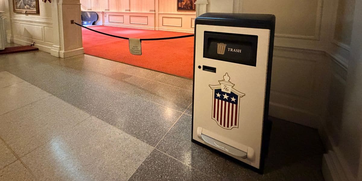
Disney has also produced indoor versions that share the same shape and design language but lack solar panels, since a panel indoors would serve no purpose.
Those have appeared in The Seas with the starfish logo, The Land with its green-and-red logo, near Soarin’ with the minimalist yellow-and-red logo, and around CommuniCore Hall with the EPCOT globe.
That is a surprising amount of variation for something most guests will never consciously register.
Magic Kingdom Is Still the Real Test
The rollout is nowhere near finished.
Magic Kingdom, Hollywood Studios, both water parks, Disney Springs, and ESPN Wide World of Sports are all still ahead.
Magic Kingdom is the one that matters. That park has the most distinct themed lands on the property, each with an established visual identity that guests are protective of. A plain gray can work in front of Mission: SPACE. It would not work on Main Street, U.S.A.
If Imagineering handles that park the way it handled World Nature and Pandora, this project ends up remembered as a functional upgrade.
If Main Street, U.S.A. gets the Mission: SPACE treatment, the complaints from June come right back.